Quick Tip: Straighten Up!

One of the easiest photo flaws to fix is a tilted picture. A horizon that's not quite horizontal or a vertical line that's not quite vertical can distract the eye away from the subject of a photo. So fix it!

Yikes. (Intentionally tilted in software for purposes of illustration.)

Most image editing programs will have at least a rotate function. You can use this to eyeball a correction. Or--my favourite--if your editing software allows, you can simply find a line in the photo that should be horizontal or vertical and, using the appropriate tool, drag your mouse along this line. The software will then do the rotating for you. Here's how to do it in my favourite software, darktable:

Open your image. In the right hand panel, click over to the basic group (the circle button), and then find the crop and rotate function. Select this function. Place your cursor at one end of a line that should be either horizontal or vertical. Right-click and hold, then (while still holding the right-click button) drag your cursor along the line to the other end. Release the button. darktable should automatically rotate the image for you.

If you're having trouble getting it just right, you can try zooming in to 100% or 200%. I find this often affords a more accurate correction. In this example, I'm using the shore as a guide, zoomed in to 100%:

Straightening a horizon in darktable. Click to enlarge.

Don't let your photos suffer from crooked horizons or diagonal verticals! Your viewers will thank you.

Behold! A (more or less) straight horizon!
18mm (~28mm equiv); 1/250 @ f/5.0, ISO 100


Smartphone Camera versus Compact Camera: Which is Right for You?

As smartphone cameras become increasingly sophisticated, many people are abandoning traditional compact/point-and-shoot cameras and instead relying solely upon their phones for their photographic needs. Is this a viable strategy for the fibre artist? Let's consider some of the advantages and disadvantages of each.

Budget

If you already have a cellphone with a decent camera, sticking with it as your fibre art camera certainly makes financial sense. At worst, you might need to buy some more memory, or a cable to transfer your photos to your computer--and chances are, you won't even have to do that.

A compact camera, on the other hand, will cost you some more money if you don't already have one. New point-and-shoots that are worth buying are, on the lowest end, somewhere in the range of $100. Used, you can get a camera much more economically, but it won't come with the same guarantees as a new one. If you're on a tight budget but decide that you want a compact camera, consider buying a used, older model through a reputable store such as Henry's (in Canada) or Adorama or B&H (in the States). Another option would be to look for a free or very inexpensive camera on a local buy/sell/trade site.

Convenience

Chances are, your phone camera is going to win when it comes to the convenience factor. Most people I know have their phones within reach the vast majority of the time. A dedicated compact camera, on the other hand, is not something most people drag around with them. Additionally, you're less likely to notice a missing memory card or a dead battery in a compact camera that you don't use regularly.

That said, you can get point-and-shoot cameras that fit easily into your pocket, so if you're leaning towards a compact camera, don't worry too much about portability.

Mindset

This may not affect everyone, but it's worth considering whether having a dedicated compact camera will get you in a more photographic mindset. Is it easier for you to take better photos when you're using a more traditional camera? For me, when I'm snapping a cellphone picture, I tend to forget everything I've ever learned about photography (don't ask me why). Having a standard camera in my hands (whether a DSLR or a point-and-shoot) just does something to me psychologically that results in better images.

Sensor

This one goes to the compact camera. Almost all compact cameras will have a larger sensor than their phone camera counterparts. A larger sensor typically translates into better image quality, especially in low-light conditions. If you're shooting in well-lit conditions, a larger sensor is still advantageous, but won't make as much of a difference.

Zoom

Almost all compact cameras will have at least some optical zoom. Almost no smartphone cameras will have any optical zoom. If zooming is important to you, then a compact camera is the way to go. Never use digital zoom if you care about your image quality!

Zooming does more than simply enlarge things that are far away. Zooming in has the visual effect of compressing the elements in the photo--of making them appear closer together. A wide angle, on the other hand, will make elements that are closer to the camera look significantly larger than elements further away. (Ever wonder why your nose looks so big in selfies? It's probably because you shot the selfies with a wide angle lens). A zoomed-in portrait is generally going to be more flattering to the subject than one taken with a wider angle. More zoom can also give you a shallower depth of field (in other words, it can help to blur your background), depending upon the aperture used, the distance of the camera to the subject and the subject to the background. Optical zoom is probably the biggest benefit of a compact camera over a smartphone camera.

Ergonomics

This is going to come down to individual preference, but in general, a compact camera is going to be designed to be used as a camera, and will be laid out accordingly. A smartphone is going to be designed to be used as, well, as smartphone, and the camera ergonomics will be less of a priority. I personally find a dedicated camera to be much more ergonomically friendly than a smartphone camera, but your mileage may vary. One benefit of a smartphone camera over a low-end point-and-shoot, however, is touch screen focus: to focus on a specific element of your scene, you can simply touch it. The cheaper compact cameras tend not to have touch screens.

In the end, only you know your needs. At least now, though, you have a few things to consider when making your choice.

How I Shot It: Unassuming Socks

I'm thrilled to announce that my new pattern, Unassuming Socks, is now available for free in the May 2018 edition of Knotions Magazine! Although not my best photos ever (they were taken many months ago, and I'm still learning!), I thought it might be fun--and possibly educational--to write a post explaining how I shot the main pattern photos.

Unassuming Socks by Shannon Donald
50mm (80mm equivalent); 1/60 @ f/4.5, ISO 800 + bounced external flash.


The Location

The photos were taken in my rather messy basement, on a February evening. Not much natural light happening there!


The Equipment

To get these shots, I used the following gear:
  • Canon EOS 80D DSLR camera
  • Canon EF50mm f/1.8 II lens
  • AmazonBasics 60-inch Lightweight Tripod
  • Neewer TT560 Flash Speedlite for Canon
  • Neewer 9.8 feet/3 m Off Camera Flash Speedlite Cord
  • a generic (i.e., I cannot remember the brand) camera remote control
  • an old red tablecloth
  • an old dresser (more on that in a minute)

The Setup

This is an impressively professional and well-thought-out studio setup. Not.

I tucked an edge of the tablecloth into the top drawer of an old dresser that was sitting in the basement. Voila! A plain red backdrop is born.

I located the tripod several feet away from the backdrop, on its lowest setting.  I placed the flash on the tripod, with the flash head pointed up and towards the white wall to the side of my backdrop (assuming I recall correctly, and that I am reading the light in my photos correctly).

The flash was connected to my camera via the Speedlite cord, which allowed it to be triggered off-camera. I situated the camera itself far enough away from my backdrop that I could shoot wide and crop later; this gave me a little more leeway in terms of where I could position myself and still be in the shot. The most professional part of all? I set the camera on a Wii Fit board with a rolled-up sock under the lens to prop it up just a little bit. Pro tips, y'all. Keep it classy.

50mm (80mm equivalent); 1/60 @ f/4.5, ISO 800 + bounced external flash.


The Process

The first step was to get the exposure right. Because my (cheap) flash is manual only (as opposed to TTL), it's a little trickier. I could have used actual math (metering, and then adjusting the settings appropriately based on the reading) but instead I used an educated guess and trial and error, because that's how I roll. My histogram helped me to quickly find acceptable settings. Once I'd established a baseline correct exposure, it was easy enough to vary my settings by keeping track of which direction and what number of stops I changed, and compensating through my other settings. I left my camera on full manual mode; otherwise my exposure would have been wrong due to the presence of the Speedlite, which would be unaccounted for by the camera's metering (additionally, I wanted a consistent exposure, and manual was the best way to achieve that goal).

Next I positioned myself in front of the backdrop. I used my remote control to take a few test shots, checked them on the LCD of my camera, and returned to take more. Because the background had little contrast, the autofocusing would only be successful when the camera locked onto my socks; this meant I didn't have to manually adjust and lock focus, making my life significantly easier (I could autofocus using the remote instead).

Because I was using a cheap flash, it would not fire if I had live view activated; therefore, I had no assistance in positioning myself. Basically, I shot a few frames, checked them on playback, and repeated, occasionally adjusting my aperture to get a different depth of field, and either ISO speed or flash power to keep my exposure the same.

Once I had a lot of shots in a variety of poses, I was done, except for a small amount of post-processing work (mainly tweaking white balance and cropping).

50mm (80mm equivalent); 1/60 @ f 5.6, ISO 400 + bounced external flash.


What I Wish I'd Done Differently
  • put my flash on my camera and my camera on the tripod (because I bounced the flash anyway, it would have made very little difference in lighting)
  • increased my shutter speed to maximum sync speed (1/250) to block out any ambient light
  • stopped down my aperture for a deeper depth of field
  • increased flash power (even though it would take longer for the flash to cycle)
  • chosen a more interesting background
Hope that was at least a bit interesting to you! If you have any questions, feel free to drop them in the comment box below.

And remember to check out Unassuming Socks, available now! It's a perfectly unisex vanilla-plus pattern for the beginner sock knitter, or the advanced sock knitter who just wants some good TV knitting.

When is it a Lie? The Philosophy and Ethics of Photographic Post-Processing

Photographic editing is a hot topic. When magazines set impossible beauty standards through extensive post-processing, the inevitable debate about the ethics of editing begins. What are the implications for fibre artists?

The Camera Never Lies... Right?

It's commonly said that the camera never lies, but that itself is a lie. A photo is never going to look exactly the same as the original scene. If you have 20/20 vision, and I can only see a foot in front of my face, which represents reality--the perfectly sharp image, or the blur of colour?

What about the innate limitations of the camera? No matter how good its dynamic range, it simply can't capture the same variation in light as the human eye. We can see details in deep shadows and bright highlights that the camera sensor will not be able to capture.

This is how the camera saw it.

And then there are the changes in perspective wrought by different lenses and focal lengths, the different renditions of colour depending on the camera's white balance and other factors (not to mention black and white photographic conversions!), the pixels, the depth of field, and any number of other factors that influence the appearance of the final photograph. Perhaps the camera doesn't lie, exactly, but we can hardly say it only tells the truth.

The Role of Image Editing

The truth is, in digital photography, all images are edited. The JPEG you see straight out of the camera has already had automatic edits applied to the raw data initially captured by the camera. There is no such thing as an unedited digital image.

I would argue that raw data, as processed by the photographer rather than the camera, can actually do a better job in representing reality than the data as processed by the camera. The photographer was there, after all. The photographer knew what the original scene looked like, and felt like, and what he or she intended by the photograph. The camera can, at best, guess at these through an automated process. How many photographs have we seen with wildly inaccurate colours? How many time has the camera seemingly added ten pounds to the model? And what about all of those photos of tourists holding up the Leaning Tower of Pisa?!

Image editing, when done thoughtfully, can convey the photographer's perception of reality.

This is how I saw it and felt it--green and gold.
23mm (37mm equivalent); 1/60 @ f/5.0, ISO 100.

Some Considerations

The guideline I use when processing my own images is simple: tell the truth. The truth, though, in the context of a photograph, is a nebulous thing. If I enhance the colours in my image to express how I remember seeing them, is this true, even if I get it wrong? If I erase skin blemishes--generally transient rather than permanent aspects of physical appearance--am I lying, or am I better telling the truth of the individual's typical appearance? I can only answer these for myself.

But fibre artists do have particular responsibilities, I think.

The designer owes it to the potential customer to accurately and honestly show the fit, construction, size, and details of the garment or other item. Editing in long sleeves when a pattern provides instructions for short sleeves would be a violation of the customer's trust, as would be editing away 30 pounds from the model's waist.

The yarn or fibre dyer owes it to the potential customer to represent the colours of the yarn or fleece as accurately as possible. Editing can (and probably) should be used if the colours in the image are not true to life, but a deep red should not be transformed into a bright pink through the magic of Photoshop. Tell the truth!

Ultimately, the decision of whether to further edit your images is up to you, the individual. I personally believe that thoughtful editing can bring the image closer to reality, make it more appealing, and better express my vision. But whatever you choose, choose it with careful intentionality and a clear understanding of your personal ethics.

Quick Tip: Instantly Improve Your Cell Phone Photo Quality

Do you use your cell phone camera, either for quick snaps, or as your primary camera? If so, we need to talk about zoom.

One thing most dedicated cameras have that cell phone cameras lack is optical zoom. Optical zoom uses--you guessed it--optics to zoom in or out of your scene. In other words, the lens itself adjusts the zoom.

A photo from my cheap cell phone camera. No zoom used. Click to enlarge.

Digital zoom, on the other hand, is essentially a simulation. Digital zoom enlarges the central portion of the image and cuts away the rest. Basically, it's doing in-camera editing--cropping and enlarging the photograph as you take it, without actually magnifying the scene.

Optical zoom will not result in a loss of quality in your image (or if it does, it will generally not be a significant loss of quality, and any loss in quality will be related to the quality of the lens itself). Digital zoom, on the other hand, will irreparably degrade the quality of your photograph.

Similar photo, same cheap camera. This time, I used digital zoom. Click to enlarge. Yikes!

So what should you do? Avoid zooming in with your cell phone camera! If possible, get closer to your subject. If you can't get closer, consider cropping in post-processing--at least you'll have more control over the final result.

If you've ever wondered why your cell phone pictures just don't look very good, digital zoom may be the culprit.

Photo Editing Techniques: Levels

Today I'm going to talk about a simple but powerful way to change the appearance of your photos: the levels tool. This post may look long, but that's because there are a lot of images--don't be intimidated! This is fairly easy stuff that can make a huge difference in your images.

The levels tool can be found in most image editing programmes (including my favourites, darktable and GIMP) but for the purposes of demonstration, I'll stick to using darktable only. I will also be using a simple image containing various tones to demonstrate the effects of levels adjustments. I encourage you to download this image and play with it on your own; the easiest way to learn is through hands-on practice:

Right click and save as to download to your own computer.


 The basic anatomy of the levels tool is a box containing the histogram for your image, with a black-to-white gradient at the bottom and a set of three sliders. The levels tool in your software of choice may look slightly different, but it should function similarly. In darktable (and in many other editors), you will also see three eyedroppers; these allow you to move the position of the sliders more precisely (more on that soon).

If you're familiar with your luminosity histogram, the levels tool will probably be reasonably intuitive. The gradient at the bottom represents the distribution of tones in your image--it's sort of a guide to reading your histogram. On the left, you have your darkest tones, in the middle you have your midtones, and on the right, you have your lightest tones.

Adjusting levels in darktable. Click on the image to see full-sized Note that the histogram at the top of this screen capture and the histogram in the levels tool are the same, and represent the distribution of tones in sample image shown at the beginning of this post.

The sliders are used to tell your image processor which tones in the original image should be rendered as pure black, which tones should be rendered as pure white, and where your middle grey should be positioned. Their default positions, therefore, will be at the far left, the far right, and the middle of the histogram respectively.

If you slide your black point slider to the right, the amount of black in the image will increase--anything that was darker in the original image than the new position of your slider will be rendered as pure black. Note that the middle slider will automatically be repositioned in the exact centre between the new black point and the white point. Note also that the histogram for your image (at the top right of the screen) will also change to reflect the new tonal distribution:

Changing the black point (and with it, the mid-point).

 Likewise, if you move your white point slider to the left, all of the tones in the original image that are lighter than its new location will be rendered as pure white. Again, the midpoint slider will automatically reposition itself to the centre between the black and white points:

Moving the white point.

Moving the middle grey slider is a little trickier to explain, but basically, the slider determines which original tone will now be rendered as middle grey. Therefore, if you move the slider to the left, your overall image will lighten (although your black point and white point will not be altered unless you choose to move them), because you are telling your editor that a tone originally closer to black should be lightened to midgrey, and therefore the other tones will also lighten to reflect the new distribution of tones. If you move the midpoint slider to the right, the overall image will darken, as you are telling your editor that it should darken what was originally a lighter tone into middle grey. This is easiest to understand by playing around with the sliders yourself.

Lightening the image by shifting the midpoint.

If you want to precisely place the black point, white point, or midpoint, you can use the eyedroppers. Simply click on the eyedropper associated with the point you wish to change, then click on the area of the image that you wish to place at that point.

So how does this work in colour? Let's play around with two examples. First, a colour distribution:

I encourage you to also download this image for practice.


Let's try moving the black point...

Shifting the black point.

...and now the white point...

Shifting the white point.

...and now the midpoint...

Shifting the midpoint.

...and now all three points:

Shifting black point, midpoint, and white point.

See how the levels tool can dramatically alter the look of your image?

Finally, let's play with a real-world example:

A Nova Scotian sunset.

See what happens if we shift the black point?

Moving the black point.

What about if we shift the white point?

Moving the white point.

And finally, what if we move the midpoint?

Moving the midpoint.

The levels tool is just that simple. And, to make life even better (at least in darktable), adjusting your levels will adjust your image in real time, letting you tweak it exactly to your liking. It's an easy tool that makes a powerful difference.

Quick Tip: Learn Some Photo Lingo

Comfortable with terms like "frogging" and "throwing" but lost at "stopping down" and "chimping"? Here is a quick lowdown on some common photographic lingo.

Stopping Down: decreasing the exposure of a shot by increasing shutter speed and/or decreasing aperture value.

Chimping: reviewing images on your camera's LCD screen. Called chimping due to the "ooh ooh" noises that such reviewing tends to produce. Useful in moderation (to check your histogram and composition) but easily overdone.

Dragging the Shutter: using a slow shutter speed with a flash in order to capture some of the ambient light.

Glass: camera lens(es).

Fast Glass: a camera lens with a wide maximum aperture.

Shooting Wide Open: taking pictures at your lens's widest possible aperture.

Bokeh: the aesthetic quality of the area of your image that is out of focus.

Prime: a lens with a fixed focal length (no zoom capability).

Nifty Fifty: a 50mm prime lens. Most DSLR brands offer cheap, fast, nifty fifty options. A great focal length for many purposes.

Pixel Peeper: someone who scrutinizes their photos at 100% on their computer monitor or other screen. Often done to look for small differences in sharpness. Usually a derogatory term.

GAS: Gear Acquisition Syndrome. The longing for evermore photography equipment.

And now you know!

Taking Control: Semi-Manual and Manual Modes

If you have a DSLR, mirrorless, bridge, or advanced point-and-shoot camera, you probably have access to several manual modes for controlling your camera's exposure. These four modes are Program Mode, Shutter Priority Mode, Aperture Priority Mode, and Manual Mode. Used in the right way, these modes can help you to get exactly the photo you want, without the hassle that you don't.

In program, shutter priority, and aperture priority modes, the camera selects the exposure (although it can be modified using exposure compensation). In manual mode, you are in full control of the exposure. Therefore, program, shutter priority, and aperture priority modes are typically considered semi-manual modes since the user influences how the camera exposes, but does not choose the exposure itself.

Program Mode

Program mode is sort of a hybrid mode--an automatic mode that lets you override the camera to one degree or another. The camera does the initial selection of settings, and then you can choose to accept them, or to override them.

The degree of control afforded by program mode varies from camera to camera. On a DSLR, program mode will typically let you adjust ISO, use exposure compensation, and shift between various sets of aperture and shutter values. On a point-and-shoot, program mode may limit you to controlling, for example, exposure compensation only, or it may allow you further control. Consult your camera manual for details.

Shutter Priority Mode

In this mode, you control the shutter speed of your camera, and your camera controls the aperture and ISO speed. You simply set the shutter speed you want, and the camera will adjust the aperture and ISO speed to correctly expose the scene, provided a correct exposure can be achieved with the shutter speed you have chosen.

This last point is important. Your camera cannot do the impossible. If you are in a candlelit room and you set your shutter speed to 1/1000 of a second, your camera simply will not be able to expose the scene correctly; even opening the aperture as wide as possible and cranking the ISO speed to maximum won't achieve a bright enough exposure (unless, maybe, there are so many candles that the room is basically on fire). Conversely, if you're outside in bright sunshine and you set your shutter speed to 10 seconds to try to turn a rushing waterfall into a smooth blur, you'll probably end up with a bright white scene even as your camera closes its aperture and slows down its ISO speed to their minimum possible respective values. Generally speaking, though, shutter priority mode lets you easily achieve a correct exposure at your desired shutter speed without having to fuss about any other settings.

There are a few reasons you might want to choose shutter priority mode, but they all basically boil down to one thing: you care primarily about the speed of your shutter and are willing to sacrifice control over your aperture and/or ISO (you may be able to restrict the range that the camera chooses from, if you so desire). Shutter priority is typically going to be most useful when you want to use a fast shutter speed to capture a quick-moving subject, but you may also use it, for example, to set your camera to the longest shutter speed that you are comfortable hand-holding in low-light conditions.

Aperture Priority Mode

This functions similarly to shutter priority mode, except you control the aperture value instead of the shutter speed, leaving the camera to choose the shutter speed and/or ISO. You might choose aperture priority mode if you want to achieve a specific depth of field, or if you are shooting in low-light conditions and want to use the widest aperture possible.

Manual

Manual mode is exactly as it sounds: you take full manual control over the exposure. Using the in-camera metering system as a guide, you decide which combination of shutter speed, aperture, and ISO your camera will use for the image. If the photo is too dark or too bright, it's your fault!

Manual mode is great if you have a specific vision for your image, if you love to be in control, if you need the exposure to remain the same from one image to the next, or if you're having trouble achieving a correct exposure using one of the other modes. I personally shoot in manual mode the majority of the time, because my camera can't read my mind--only I know exactly what image I want to make.

Some cameras will let you set your ISO to auto in manual mode. Although I typically prefer to control the ISO value myself, I will sometimes switch to auto if I am shooting in rapidly-changing light (especially if I'm shooting a rapidly-moving subject in rapidly-changing light!), or in low light (to keep the ISO value as low as possible when I know what shutter speed and aperture values I want). To add another wrinkle, it can be difficult or impossible to use exposure compensation when using auto ISO. If your camera will let you do so, your manual will tell you how.

So that's about all there is to know about semi-manual and manual modes. Some cameras (such as DSLRs and higher-end compacts) will offer you access to all of these modes; others to some or none. Their particular properties may vary slightly from camera to camera, so it's always a good idea to be familiar with the specifics of your own equipment.

Any questions? Still unclear on anything? Do you have a favourite shooting mode? Drop a comment below!

Seven Ways to Improve Your Fibre Photos

Want to improve your knit, crochet, or other fibre art photography? Here are some ideas.

1. Read your camera manual.

I will probably harp on this in at least 50% of the posts I write about photography. That's because it's really, really important. If you know how your camera works, you have a much better chance of making it do what you want, when you want. You also won't waste valuable time (and possibly valuable light) trying to figure out if and where you can change a particular setting, or doing excessive trial and error in hopes of somehow getting the shot you want. Don't understand something in your manual? Google it. You never know when you'll need that piece of knowledge.

2. Work with your light.

Photography is all about light. If you don't work with your light, your photo will suffer for it--and this is as true for product photography as it is for art photography. Unless you're well-versed in the use of artificial lighting, your best bet is probably to stick with natural light. Although an overcast day might not give you beautiful blue skies in the background, it will provide you with soft, diffused light. This light is almost universally flattering. It might be a bit flat for an artistic shot, but it'll do very nicely for taking a pattern photo.

On the other hand, direct sunlight can be more difficult to work with (it certainly can be done, but it requires some experience, and often the use of fill flash and/or auxiliary equipment). If you must take photos on a sunny day, try positioning your subject in the shade, just at the edge, so the subject gets some softer light. If your subject is still suffering from hard shadows or a dark face, this is a time when you actually should use your flash. It'll help to fill in the shadows and get you a more even exposure.

In a matter of seconds, the diffused sunlight from the window I was working with turned into this harsh, direct light, destroying the image.

Can't get outside? Position your subject next to a large window or another source of natural light. If possible, turn off other light sources such as overhead light. Can't do that either? At the very least, avoid on-camera flash, and play with your white balance to eliminate unflattering colour casts from the artificial light in your scene. Consider using a tripod, since lower light will probably lead to longer shutter speeds and will introduce the risk of camera shake, which results in blurred photos.

Soft light from a window in another room.

3. Consider your background.

Before you snap your photo, look all around your frame--whether it's your viewfinder, or an LCD screen. Watch for things like trash, or the corner of a piece of furniture, or your cat's tail. Unintended objects in a frame can draw attention away from where you want it, towards where you don't. Keeping your backgrounds clean is one of the quickest ways to improve your photos. Don't be afraid to move things to tidy up your background (or your foreground, for that matter)!

Ugly light, ugly background--is there anything about this picture that is right?

Think about how your background can contribute to or detract from your item. Are you trying to photograph a light blue mitten against white snow? Chances are, you'll lose some details. Try to find something with better contrast. Or are you trying to photograph a winter hat on what is clearly a bright summer day? Try to find a background that looks at least a little more appropriate for cold-weather gear. Avoid backgrounds that are visually busy; you want the focus on your subject, not your surroundings. Instead, choose backgrounds that make sense--backgrounds that somehow relate to the item, and show it off to its best advantage.

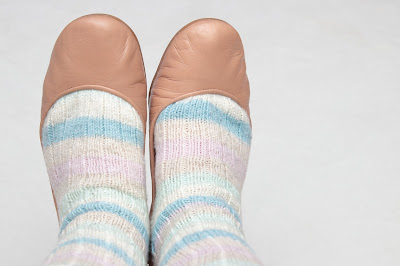
Soft light and a clean background. A bit boring, maybe, but a much better representation of the socks.

4. Place your elements intentionally.

Don't just centre your item in the frame and then snap the photo. Consider details, such as where limbs start and end (in a modeled shoot), or whether something might look better off to one side. Are you too far away from your subject, leaving it small in the frame? Move closer, or zoom in. Are you missing just one small portion of your subject, or feel like there's no breathing space around it? Move further away, or zoom out. If you're including props, consider where you want to place them. Don't obscure the best details of your design by placing the prop in between the details and the camera.

Consider also whether a horizontal or a vertical orientation is most appropriate. Often this will be obvious; if the item is wider than it is tall, it will generally work better in horizontal (landscape) orientation; if the item is taller than it is wide, it will generally work better in vertical (portrait) orientation. If you're not sure, take a few shots in both orientations and decide later, when you can see your images on your much larger computer screen. And even if the orientation seems obvious, consider shooting a few snaps in the other direction anyway--you might surprise yourself with what works.

Basically, everything in the frame should be in the frame, and in a specific location in the frame, because you intend for it to be there. Obviously this isn't always possible, but it should be the goal.

5. Use props wisely.

A photo can be greatly improved by the inclusion of some props, but these props should make sense. For example, placing a lace shawl on a table next to some fine jewellery makes sense; placing that same shawl next to a frying pan probably doesn't! You might want to style a pair of hands in mittens, and having those hands hold a snowball or a Christmas ornament would look great, but you probably want to avoid having them hold a popsicle!

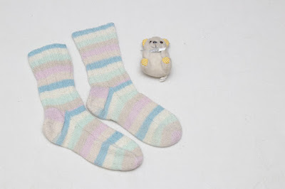
Okay, it's a cute enough teddy, I guess, but why is it there?

Those examples are obvious, but there are more nuanced pitfalls, too. For instance, if you're positioning a knit item with some knitting-related items, you might want to avoid placing scissors in the shot. Maybe it's just a personal thing (and I know we use scissors near finished items all the time, to trim ends and so on), but seeing scissors next to a beautiful knit object always makes me cringe just a little, and worry that something will accidentally be destroyed. Likewise, lit candles near knitting make me just a little nervous. This is more a matter of personal taste, but I think it is something to be at least conscious of when planning your images.
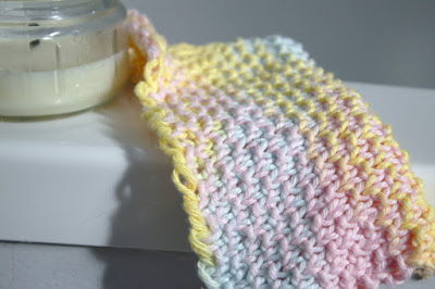
6. Tell a story.

You definitely want to focus on the design itself, but if you can include an element of story, your pictures will be more compelling--encouraging your viewers to focus on them for longer. Maybe you can relate your subject's surroundings to your pattern name. Maybe you can display a shawl on someone pictured preparing for a fancy night out. Maybe your blanket can be shown on someone lounging with a mug and a book. Emotional involvement makes for a more compelling photo!

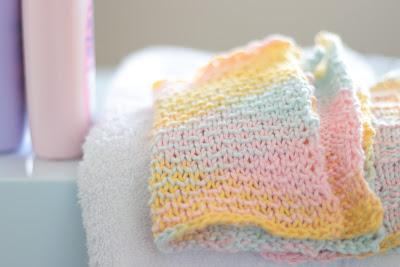
Shampoo bottles and a towel make sense with a washcloth, and bring to mind a day at the spa.

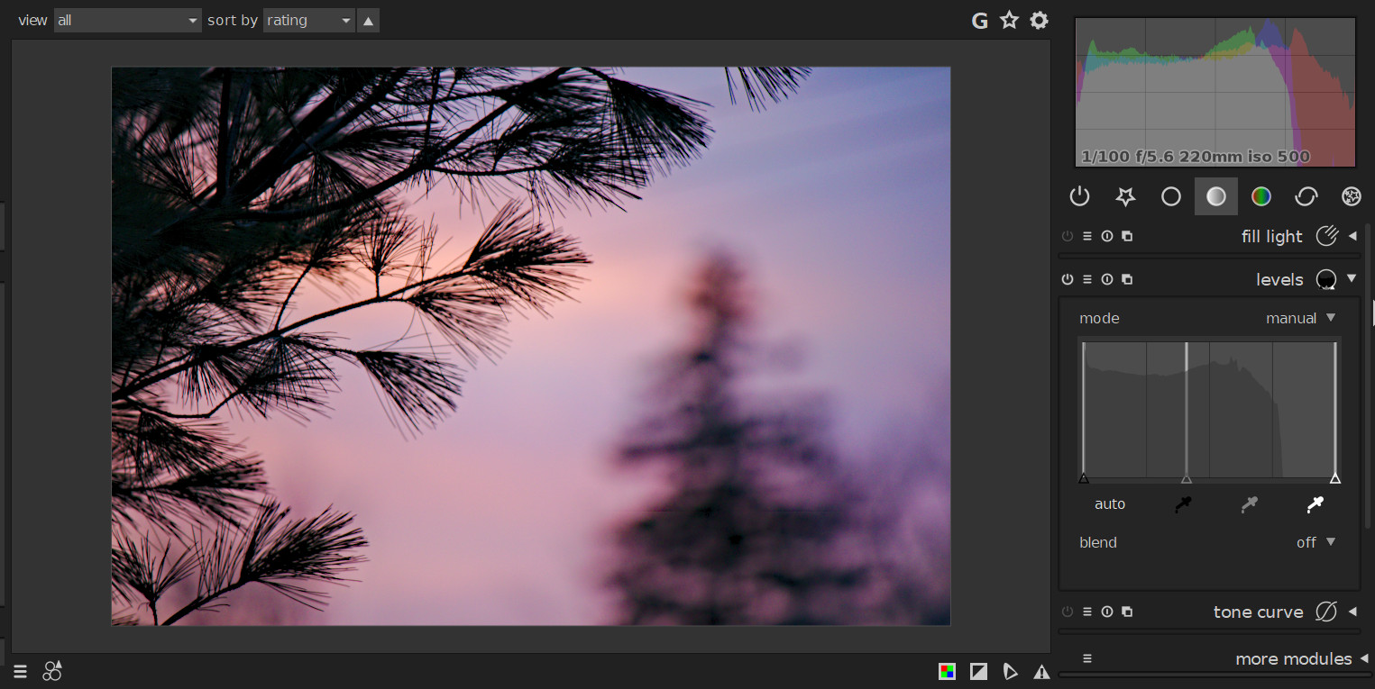
7. Learn basic post-processing.

You don't have to be a whiz, but the ability to do some basic adjustments to your photo can be immensely helpful in improving image quality. Make sure your horizons are straight, and anything that should be vertical is vertical. Is your white balance correct? Could your image benefit from a bit of sharpening (but don't go overboard, and don't bother trying to fix a blurred or out of focus image--it won't work)? Maybe you need to bump up the saturation a bit? Does your model have a pimple in the middle of her forehead that's attracting attention away from your beautiful hat?

Processing matters!

You don't want your image to look obviously processed, but sometimes doing a bit of post-processing work can make your photo look closer to your original vision, or can simply make it more attractive or eye-catching. You may not love investing the time to learn new software, but it will almost always pay off.

What has made the most difference in improving your photos? Where do you still need to do some work? What tips do you have for your fellow fibre artists? Let me know in the comments!

One Skein Photo Challenge: 14/52

Here we are in week 14 of my one skein photo challenge. Nothing spectacular this week, but the point was to explore: I didn't know quite what was going to happen when I put the yarn behind glass and bounceded the flash in different directions, so I figured it out. This is the best of the bunch.

232mm, 1/100 @ f/5.6, ISO 400, flash manually adjusted and bounced
Hope you're having a good weekend!

Raw Processing: Introduction to darktable

As I mentioned in a recent post, I use the program darktable for the bulk of my raw file development (and I plan to use it for file management, when I get around to actually, y'know, managing my files). I thought I'd give a brief overview of the program for those who might be interested in getting a taste of it without committing to an installation, or those who have recently installed it and find themselves completely lost.

 
darktable for Windows: lighttable
This is something like what you'll see when you open darktable, provided you have imported files into the program already. This is the lighttable section of the program.

On the left panel, you have options to import files and folders, view imported images (filtered in a variety of ways depending upon user instructions), see recently used collections of images, and see the image information (such as EXIF data and file location) for the photo you have selected in the central panel.

In the centre panel, you'll see a variety of images. The particular images you will see will depend upon the selections you make in the left panel. You can further filter the displayed images with options at the top and bottom of the panel. Also in this centre area are display options and access to global preferences (click the wheel icon).

(Quick tip: if you hover your mouse over a photo in the centre panel and hold down z on your keyboard, the photo will be enlarged until you release z. If you hover your mouse over photo and hold ctrl+z, the photo will be enlarged with indications over all areas that darktable detects as being in focus.)

In the right panel you'll find a variety of functions, such as tagging options (for file management), styles (similar to Adobe Lightroom presets; these provide preconfigured edits to selected images), metadata editing, and export options (to convert edited raw files to image files).

The lighttable is used mainly for file management and export; you won't typically perform edits in this area except, perhaps, for batch processing with styles (but I don't recommend this approach).

If you want to edit an individual raw file, you have two options: you can double-click on it, or you can select it and then click on "darkroom" to the top right of window. Either way, you'll be taken to the darkroom.

darktable for Windows: darkroom

The darkroom is where the real magic happens. Here you can take control over the appearance of your final image through a seemingly endless (and, therefore, initially intimidating) choice of tool modules.

At the centre of the screen, you'll see the image you are editing. At the bottom of the screen, you'll see thumbnails of other images, which can be double-clicked for quick editing access. Between the main screen and the film strip of images is a narrow bar with several icons; these include, on the left, quick access to presets and styles, and on the right, over- and under-exposure warning toggles, and soft-proofing and gamut checking toggles (full disclosure: I have only the faintest idea what the latter two toggles are used for).

The left panel of the screen holds a number of drop-down modules. Snapshots allows you take a quick grab of your image at a given point in the editing process, and later compare that snapshot to the edited image as it currently stands. The history module shows all of the edits you have made to the raw file. These edits are stored in an XMP sidecar file--what this means, in simple terms, is that no edits are made to the original file itself; this is why darktable is described as a nondestructive editor. You will probably notice that even if you have opened a file for the very first time, there will be some items listed in the history module; this is because darktable applies certain basic adjustments automatically. Under the history module are a global colour picker module, a tagging module, an image information module, and a mask editor module. The mask editor module allows you to manage masks that you have used to apply local edits to particular areas of your image (versus applying the edits to the entire image).

The right panel of the darktable is where most of your work takes place. At the top of the panel, you'll see the histogram for your image, as well as some basic image information. There are various options for how the histogram is displayed, and if you wish, you can perform some very basic edits on your image by dragging either side of the histogram. Under the histogram are seven icons, linking you to various groups of editing modules. In the above example, you can see the basic group (accessed by clicking the plain circle icon), with the base curve module expanded. At the bottom of the panel you will see an area labeled 'more modules'; here you can control which modules are displayed for easy access, which modules are hidden, and which modules are included in your favourites section.

So that is a very basic overview of darktable, quite possibly using some incorrect terminology (the darktable user manual, for example, uses panels to refer to areas such as the history stack and the mask manager rather than to the different areas of the screen). Interested in learning more? Keep an eye on this site, or delve further into the manual by clicking here.

darktable is nondestructive, free, and open-source, and available for a variety of operating systems (chances are pretty good that yours is one of them). It was designed by photographers, for photographers--and in my experience, the photographers' influence is easily seen in all of its functions. Check it out if you like how it looks!