So, now that you've learned about how the camera exposes images, you need to be able to judge the quality of your exposure. To a degree, simply looking at the image will give you a rough idea of how it has been exposed. The problem, however, is that camera screen brightness and the brightness of your surroundings can have a major impact on how the image appears during camera playback. An image on a bright camera screen might look overexposed when, in actual fact, it is dramatically underexposed. Fortunately, there is a better way. Enter the luminosity histogram. (Don't worry, this isn't high school math, nor do you need to know high school math. I promise, this is pretty easy stuff once you get the hang of it). There are also RGB (red, blue, and green) histograms available to you that give you information about the individual colour channels in your image, but here I'll only be discussing the luminosity histogram.
Here's the quick version:
The luminosity histogram is a depiction of the tones in your image. Tone basically describes how light or dark a given colour is, ranging from pure black to pure white. Midtones are, as expected, in the middle. The luminosity histogram shows you the distribution of tones in an image from dark (left side of the histogram) to light (right side of the histogram). If the histogram is tall in the middle, it means that there are a lot of areas of midtones in the image. If the histogram is bunched to the left, it means that the image is very dark. If the histogram is bunched to the right, it means the image is very light. If there are spikes at both ends of the histogram and a dip in the middle, it means that there are many pixels that are very dark in the image, and many pixels that are very light in the image, but very few pixels that are in the midtone range.
The ideal histogram is one that reflects how you want the image itself to look. It's that simple. If you have a lot of light tones in the image and you want them to look light, you want your histogram to skew to the right. If you have a lot of dark tones in the image and you want them to look dark, you want your histogram to skew to the left. And so on.
Most cameras will let you turn on the histogram in playback mode. Check your manual for how to do this. If you take a quick glance at the image after you shoot it, you'll get a pretty good idea of how it's exposed. Another option most cameras offer is a highlight clipping warning, more commonly called "blinkies". If you turn this on, any parts of the image that are pure white (and therefore contain no detail--blown or clipped highlights ) will flash on your screen. This leaves you free to judge whether you need to retake the image because you overexposed, or whether those highlights should, in fact, be clipped (such as if you shot into the sun or another bright light source).
That's the (relatively) short version. Still with me? Let's take a look at some examples in more detail.
 |
| 1/100, f/2.8, ISO 400 |
Here we have a nice glass of Scotch, in a nice bright setting. Notice the lack of dark and black areas in the image, and the abundance of light areas. Now let's look at this image with its histogram (click to enlarge if you're having trouble seeing the histogram properly).

See how the histogram bunches to the right-hand side and is empty on the left-hand side? This reflects the absence of darker tones in the image. The large spike to right of the image reflects the light-coloured background. The small hump near the middle of the histogram reflects the midtones in the image--the Scotch and its glass.
Let's look at the histogram for the same image after converting it to greyscale to make the tones a bit easier to perceive.

Note that the histogram is essentially identical (some slight differences due, as far as I can tell, to the nature of the conversion process). Again, there is an absence of dark grey or black tones, and a preponderance of light grey tones, and, therefore, the histogram is skewed to the right. The glass and its contents (especially the right-hand side) is more of a light-middle grey but takes up less relative space in the image than the lighter background, so the hump on the histogram that represents the midtones is smaller than the peaks representing lighter tones.
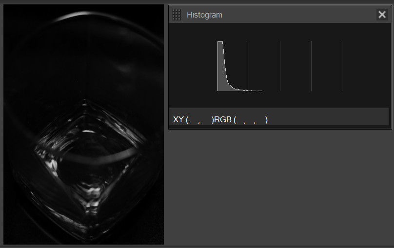
Let's look at another example. Here's the same glass of Scotch, in a somewhat moodier setting.
 |
| 1/80, f/2.8, ISO 1600 |
I intentionally underexposed this image because I wanted all but the highlights of the Scotch to disappear into shadow. What do you think the histogram will look like? Let's see.

As you probably guessed, this histogram is heavily skewed to the left. In fact, you can see from the straight left edge that many of the pixels actually touch the left boundary of the histogram, meaning that they are pure black and have lost all detail. The small tail on the right of the histogram represents the parts of the image that are dark- to midtones--specifically, the whiskey, and the highlight on the rim of the glass. Again, let's take a peek in greyscale.
Sure enough, we have a mostly black image with small areas of dark- and mid-grey.
So what does the histogram of a correct exposure look like? It depends.
First of all, the only "correct" exposure is one that reflects what the photographer intended. So if I were trying to show all of the details of the Scotch's surroundings in the second image, the exposure would be incorrect--I lost much of the detail in shadow. However, because that was the effect I wanted, the exposure is correct for my purposes.
Let's take a look at a more classically-exposed image, with a larger range of colours and tones (not a great photo, but useful enough for the purposes of example).
 |
| 1/100, f/5.0, ISO 12800 (no, I don't know what I was thinking either) |
So what do we expect to see in the histogram? Well, we have a nice wide spread of tones. There are some very dark tones in the bottle behind the glass, and some highlights where the sun was peeking in through the curtain, but there are also a lot of tones in between the two extremes. Let's take a look at the histogram.

Sure enough, the histogram reflects the wide tonal range. This is something like what the histogram of a correctly-exposed image will often look like. But if your histogram doesn't look like this, that doesn't mean your image is wrong; it simply means it's different. Whether it fits your purpose is what matters. If, for instance, you have a lot of snow in the background of your picture, you will probably hope to see a nice spike at the right of your histogram--perhaps even a peak of pixels encountering the right boundary that are pure white. If you are showing off a nice black shawl, on the other hand, you will probably hope to see a nice spike at the left of your histogram. If you know the effect you're going for, and can approximately gauge the important tones in your scene, you can get a pretty good idea from your histogram of how your exposure looks, regardless of the brightness of your camera screen or the level of ambient light around you. Cool!
One last thing--let's talk a little bit more about clipping. I touched on it above, but basically, clipping is what happens when parts of your image are outside of the recordable range of tones or colours. This means that there is no image detail in those parts of the picture; in the case of clipped dark tones, for example, any pixels in the clipped area will appear as pure black (even if there was detail visible to the eye at the time of shooting); likewise, clipped highlights will appear as pure white. If you try to shift the exposure a bit in post-processing, or try to recover detail in highlights and shadows (a fairly common procedure, especially when processing raw files), there won't be any detail in those areas to recover.
If you have a flat edge on the left or right boundary of your histogram, it probably means that you have lost detail from the shadows or highlights. This doesn't necessarily mean there is anything wrong with your picture. As mentioned above, I intentionally underexposed and lost details in my shadows in the darker image of the Scotch. Clipping is, however, something to be aware of. To help you out, most cameras will offer you highlight clipping warnings--more colloquially known as "blinkies" or "zebra stripes". Check your manual to learn how to turn on this feature. If you turn on this warning and you have blown highlights in your picture, the playback image on your camera will look something like this:

Note the flashing red areas of this image. These are areas where the highlights have been clipped. Looking at the playback image, I could decide if I wanted to reshoot the image with a darker exposure to try to recover detail in those highlights, or if I was comfortable letting those highlights blow out. The highlights in this image are a few bright spots of light from the sun, so I was happy to leave them as they were. If, on the other hand, I were shooting a pair of white socks and I was getting blinkies somewhere on the socks, I would probably want to reshoot with a darker exposure so as not to lose important detail.
The luminosity histogram takes a bit of mental work to get the hang of, but once you understand it, it is an invaluable tool in your photographic arsenal. Now go forth and practice--and maybe drink some Scotch for me, because my bottle, as of earlier today, is sadly empty.
No comments:
Post a Comment